Jackrabbit Design System
Company
Jackrabbit Technologies
Tools
Figma, Confluence, Storybook
Role
Owner & Contributor
Deliverables
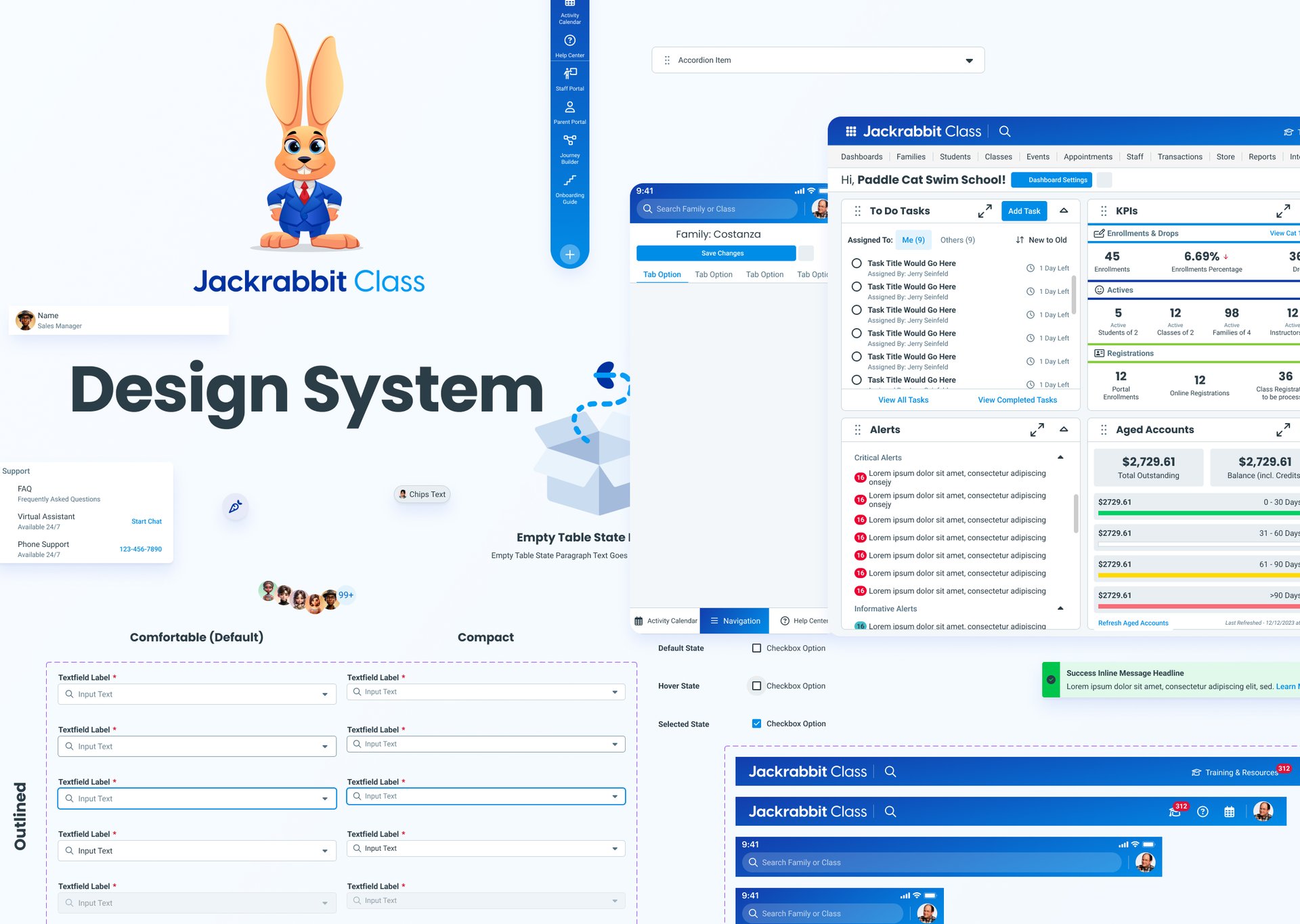
Design library
Component guideline
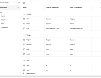
Design tokens
Component documentation site
Project Overview
As our SaaS platform rapidly scaled across multiple teams and product lines, it became clear that we needed a centralized design system to ensure visual and functional consistency across our user experience. Inconsistent styles and components, and duplicated design efforts were slowing down our workflows and creating friction between design and development teams.
To address these challenges, I have had the opportunity of spearheading the development of the Jackrabbit Tech Design System (JTDS). This complex system is currently in development and will be leveraged by three digital products.
What were the challenges?
Inconsistent UI Across Products
With multiple teams designing in silos, our UI components had drifted apart significantly. This lead to inconsistent experiences, duplicated efforts, and brand mismatch.
Lack of Source of Truth
Designers and developers lacked a shared up-to-date repository of components and styles. This led to guesswork during implementation and inconsistencies in both look and behavior.
Retrofitting vs. Building New
Balancing the need to standardize legacy UI with the desire to build future-proof components posed technical and design tradeoffs.
Accessibility Inconsistencies
Ensuring that all components met accessibility standards (e.g., WCAG) across different browsers and devices required a deliberate and often overlooked design/dev effort.
While exploring the existing brand assets and design documentation, I developed a clearer picture of the underlying challenges affecting team consistency and workflow.
Hypothesis
We noticed...
Resulting in...
that as our product offerings grew, each team was building UI components slightly different.
inconsistent experiences and duplicated effort.
By introducing a...
centralized design system with shared tokens, components, and guidelines, we can give teams a common foundation to build from.
Desired Results
Problem
Solution
We hypothesize this will...
improve the visual and functional consistency across our platform and also speed up development time and make cross-team collaboration more smooth.
Mission
Create 3 Products, Powered by the Same Design System
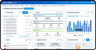
Jackrabbit Admin App
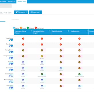
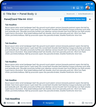
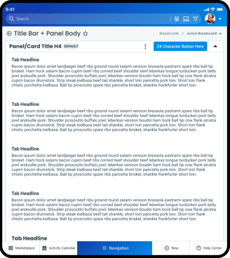
Jackrabbit Staff Portal
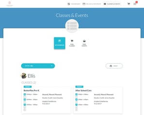
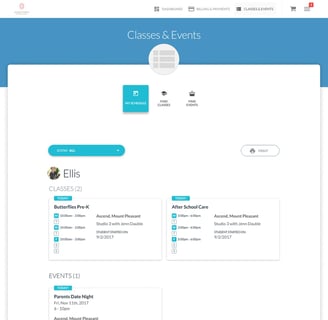
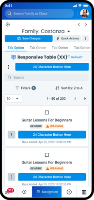
Jackrabbit Parent Portal
A comprehensive, cloud-based management platform designed for youth activity centers such as dance studios, swim schools, and gymnastics programs.
A mobile-friendly application designed to streamline staff management for activity-based organizations.
A mobile-responsive platform that empowers families to manage their child's activities at youth-focused organizations like dance studios, swim schools, and gymnastics centers.
Atomic Design
To address the complexities uncovered in the challenges, a more structured and scalable approach was essential.
This led to the adoption of Atomic Design, a methodology that breaks down interfaces into hierarchical components, enabling a modular and systematic design process
With Atomic Design, Jackrabbit can create modularity to form consistency.
Atoms - Buttons, typography, colors
Molecules - Input field with a label
Organisms - Navigation bar with multiple buttons and input fields
Templates & Pages - Fully functional screens


Atoms
Molecules
Organisms
Templates
Pages

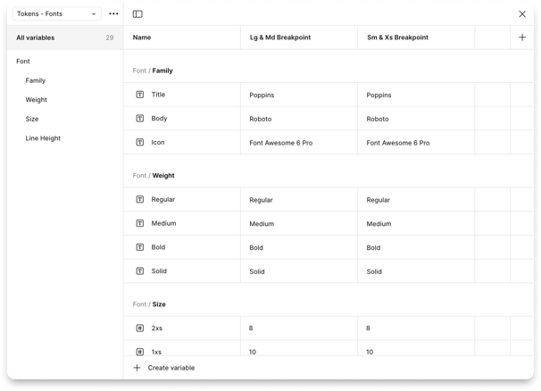
1. Core Foundation
The Core Foundation lays out the essential building blocks of the visual language. It defines standards for color, typography, spacing, border radius, elevation, grid systems, etc to ensure consistency across all interfaces.
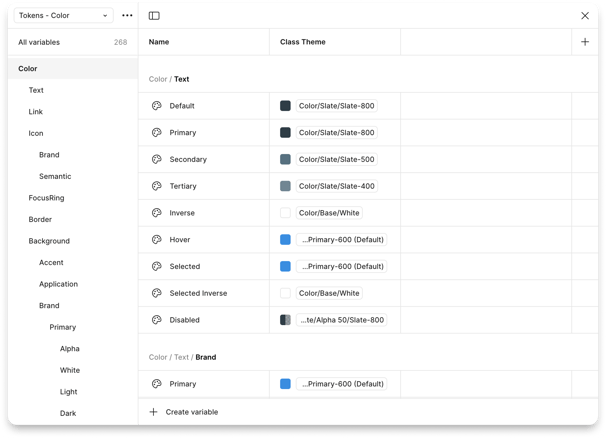
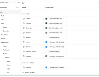
Colors
Primary Colors

Secondary Colors

Tertiary Colors

Slate Colors

Greyscale Colors

Success Colors
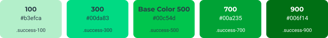
Danger Colors
Warning Colors
Informative Colors
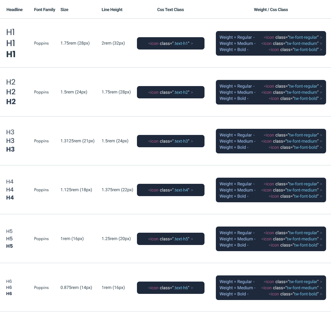
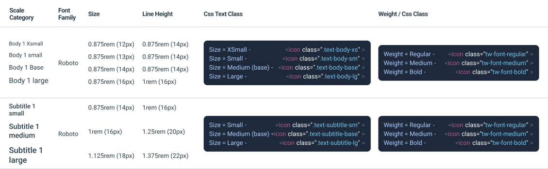
Typography
Desktop Headlines
Body & Subtitle
Logos & Brandmarks
Logos
Brandmarks

2. Components
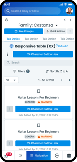
The Component Library included a robust set of reusable UI elements, such as buttons, form fields, modals, and navigation patterns, all designed for scalability and built in alignment with our frontend framework.
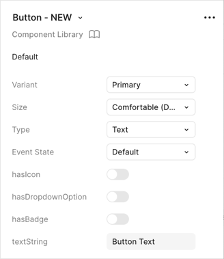
Buttons
Primary Filled

Secondary Filled

Tertiary Filled

Sizes
Spacing


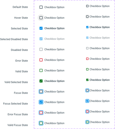
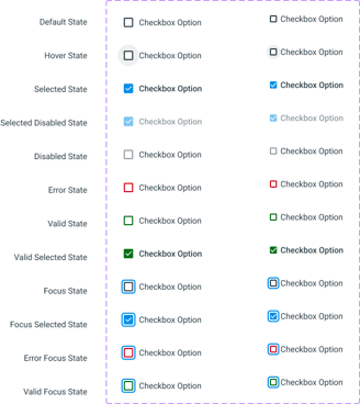
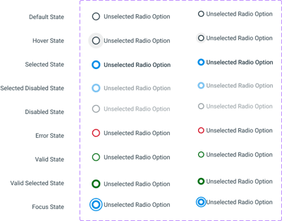
Controls
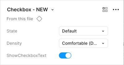
Checkboxes
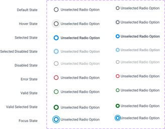
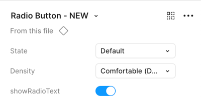
Radio Buttons
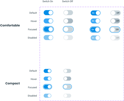
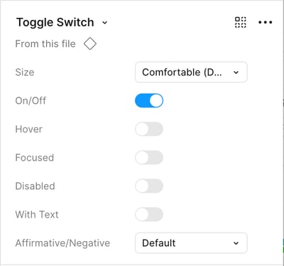
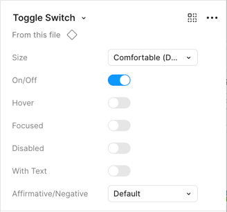
Switches

3. General Patterns & Workflows
General Patterns outlines common interaction behaviors and layout strategies, providing guidance on usage across various product contexts.
The Workflows section focuses on end-to-end user journeys, mapping out how components and patterns come together to support real product use cases and ensure usability across tasks.
Patterns & Workflows
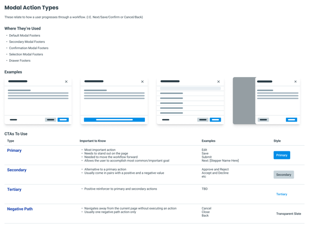
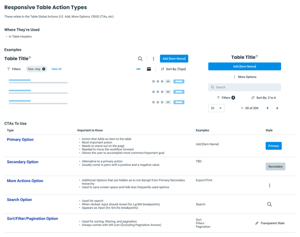
Call To Action Placement
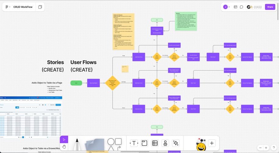
CRUD
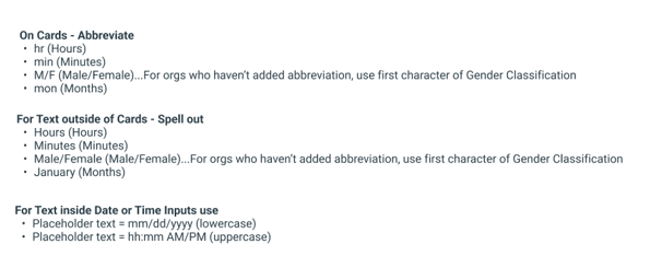
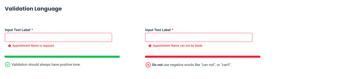
4. UX Writing
Lastly, UX Writing section provides content standards and voice/tone guidelines to support clear, consistent communication across the product, reinforcing both brand identity and user comprehension.
Content
Rules
Outcomes • Testing • Reflection
The implementation of the design system at Jackrabbit has led to measurable improvements in both workflow efficiency and product consistency. Teams were able to design and develop new features faster, thanks to a growing library of reusable components grounded in Atomic Design.
40%
60%
Drop in UI-related QA issues
Reduction in design-to-development time

Design reviews became more focused on user experience rather than alignment or spacing inconsistencies, allowing teams to move faster and with greater confidence.
Reflecting on the process, one key takeaway was the importance of cross-functional collaboration. Involving engineering early ensured the components were not only visually consistent but also technically feasible and performant.
What's to come
With a solid foundation in place, the Jackrabbit Design System is poised to expand beyond its initial scope. The next phase of implementation will focus on bringing the same level of consistency, efficiency, and user-centered design to two of our core platforms: the Staff App and the Parent Portal App.
30%
Reported user-satisfaction NPS score increase
25%
User task completion improved