Jackrabbit Design System
Company
Jackrabbit Technologies
Tools
Figma, Confluence, Storybook
Role
Owner & Contributor
Deliverables
Design library
Component guideline
Design tokens
Component documentation site
TL;DR
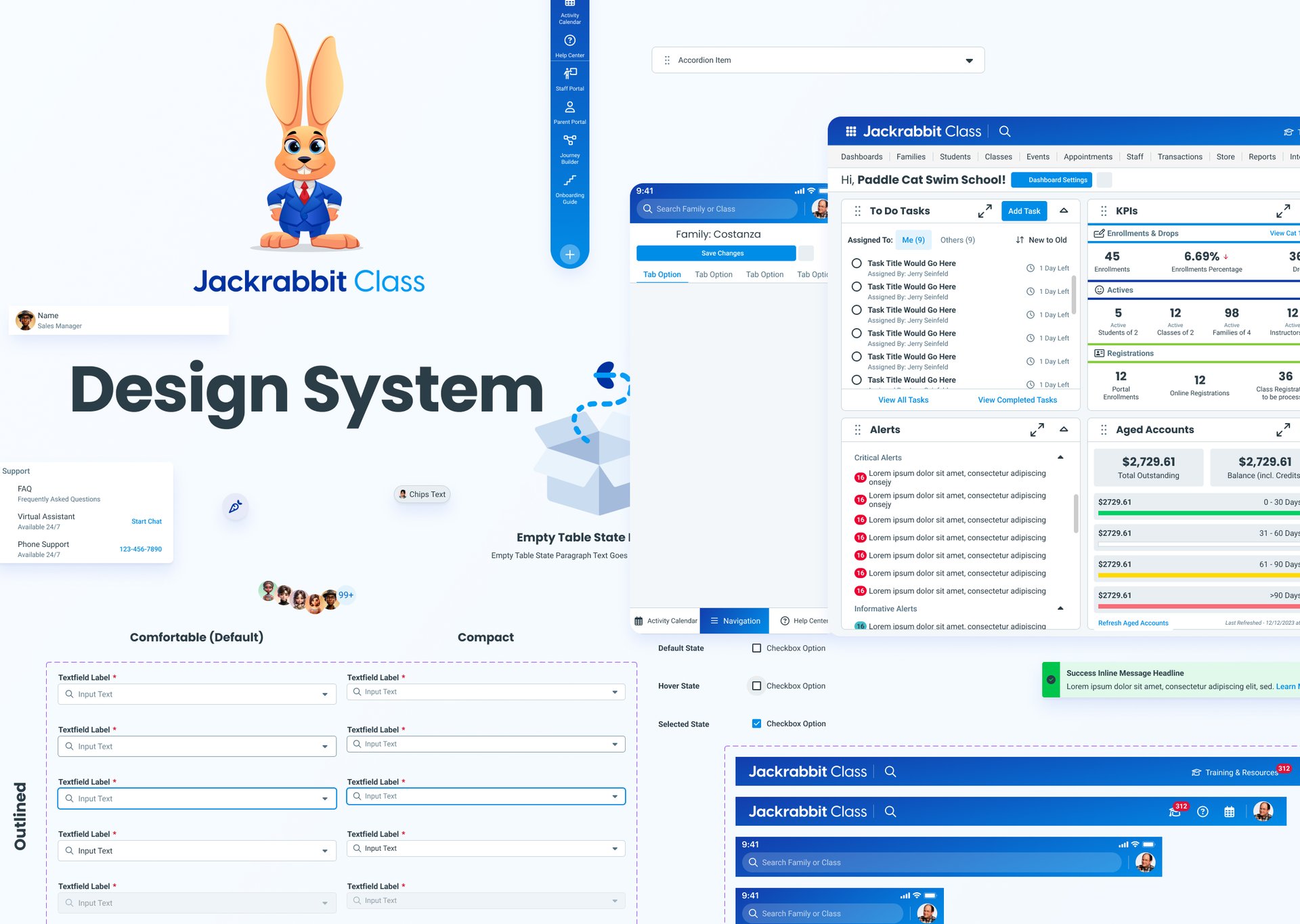
00 - TL;DR
Rebuilding Jackrabbit's most-used feature for scale.
Three products drifting apart, with no shared source of truth.
Challenge
Approach
Rebuilt the system with atomic design, one foundation composed up into every screen.
Method
Tokens, fully-documented components, reusable patterns, and content standards.
Result
60% UI QA issues, −40% design-to-dev time, +30% NPS, built to scale.
01 - The Problem
Three products drifting apart.
While exploring the existing brand assets and design documentation, I developed a clearer picture of the underlying challenges affecting team consistency and workflow.
Challenges affecting team consistency and workflow. Every one of them tracing back to the same missing source of truth.


Inconsistent UI Across Products
With multiple teams designing in silos, our UI components had drifted apart significantly. This lead to inconsistent experiences, duplicated efforts, and brand mismatch.
Lack of Source of Truth
Designers and developers lacked a shared up-to-date repository of components and styles. This led to guesswork during implementation and inconsistencies in both look and behavior.
Retrofitting vs. Building New
Balancing the need to standardize legacy UI with the desire to build future-proof components posed technical and design tradeoffs.
Accessibility Inconsistencies
Ensuring that all components met accessibility standards (e.g., WCAG) across different browsers and devices required a deliberate and often overlooked design/dev effort.
Consistency
Source of Truth
Tradeoffs
Accessibility


02 - Hypothesis
Hypothesis
inconsistent experiences and duplicated effort.
Problem
We noticed
that as our product offerings grew, each team was building UI components slightly different.
Resulting In
Solution
By introducing a
centralized design system with shared tokens, components, and guidelines, we can give teams a common foundation to build from.
Desired Results
We hypothesize this will
improve the visual and functional consistency across our platform and also speed up development time and make cross-team collaboration more smooth.
Every challenge traced back to the same gap: no shared foundation. I rebuilt the system with atomic design, composing small, reusable pieces up into full screens so all three products build from one source instead of three.
Atoms - Buttons, Inputs, Labels, Icons, etc
Molecules - Input field with a label
Organisms - Navigation bar with multiple buttons and molecules
Templates & Pages - Fully functional screens


Atoms
Molecules
Organisms
Templates
Pages
03 - The Approach
One system, built atomically.

Foundations are the shared language beneath every component. Color, type, spacing, and more, defined once as tokens so all three products stay consistent by default. Change a token, and every component using it updates in step.
04 - Foundations
The tokens everything is built on.


Colors
Primary Colors


Secondary Colors


Tertiary Colors


Slate Colors


Greyscale Colors


Success Colors


Danger Colors


Warning Colors
Informative Colors


Typography
Desktop Headlines


Body & Subtitle


Logos & Brandmarks
Logos





Brandmarks


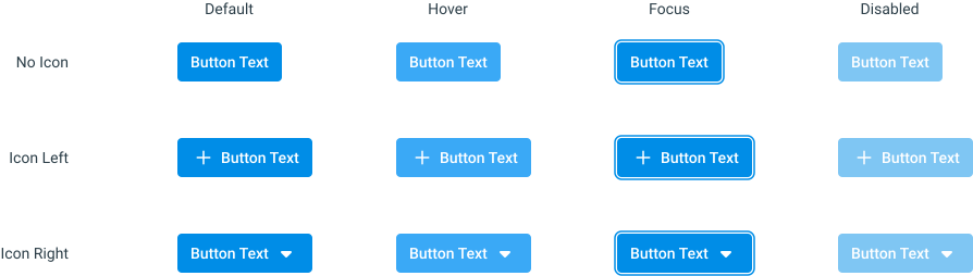
Components are where the foundations become usable. Buttons, inputs, controls, built once with every state and variant defined. Nothing left to a developer's guess: default, hover, focus, disabled, error, and valid, all specified.
05 - Components
Every state, documented.
Buttons
Primary Filled
Secondary Filled
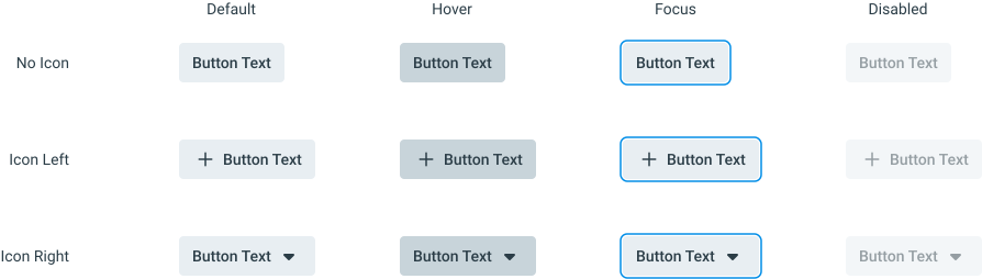
Tertiary Filled
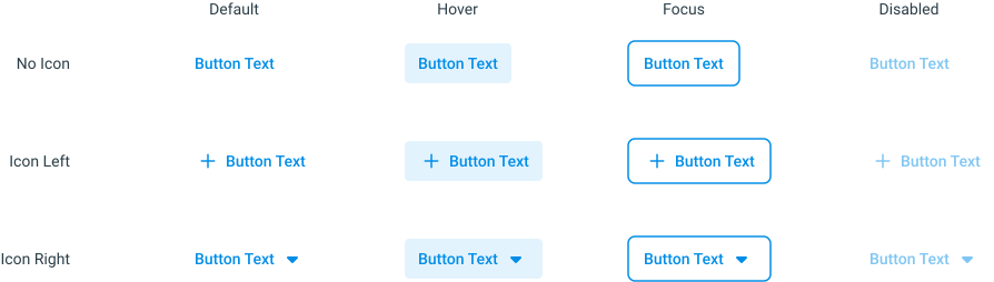
Sizes
Spacing




Controls
Checkboxes


Radio Buttons


Switches


Foundations and components answer "what things look like." Patterns answer "how they work together." This is where I defined the reusable solutions to recurring product problems, so teams stop re-solving the same interaction from scratch
06 - Patterns & Workflows
How the pieces solve real problems.
Patterns & Workflows
Call To Action Placement


CRUD


Most systems stop at components. I built content standards in too. Voice, formatting, and validation language so the words stay as consistent as the UI.
07 - UX Writing
Content as part of the system.
Content
Rules


08 - Impact
One system, measurable results.
-60%
UI-related QA Issues
fewer inconsistencies
−40%
Design-to-Dev Time
reusable components
+30%
NPS Score
reported user satisfaction
+25%
Task Completion
across core flows
SPEED
Speed
Satisfaction
Usability
Internally, the modular design-system approach cut design and development time for future enhancements.
09 - Built to scale
I built the system to outlive any one product, so the next two could adopt it without a rebuild.
Structured so staff-facing workflows could adopt the same foundation directly.
Ready for the Staff App


Ready for the Parent Portal
The family-facing experience could extend from the same atomic base.

One Foundation, no Drift
Every future product draws from the same tokens and components.